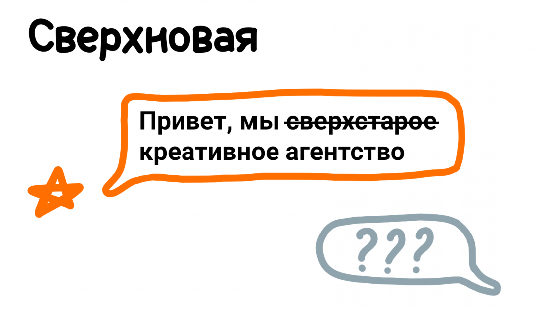
snova.agency website Сабирзянов Глеб
This work
in other
nominations
Corporate Sites
Task
We made this project for ourselves. The task was to show the creative agency well known on the regional market in 90s-2000s, the beginning of the capitalism in Russia. The goal was to show that the while agency is on the market for a long time, it doesn’t get old and dated. To create the impression of the creative people who know their worth. To tell about the agency in the ironic manner, without showing off.
Ideas and solutions
In the modern world people use digital means of communication such as email or messengers on a daily basis. This format is familiar to people, that’s why we decided to tell our story in the form of a dialogue — a friendly conversation between the website visitor and the agency. This is a personal conversation so the relationship becomes almost intimate. We speak to the human in the most humane way, using casual language. Besides such a friendly verbal communication, visual style is also very simple and familiar. All the pompousness and unnecessary seriousness were excluded. Graphical elements, illustrations and even a logo are made in the style of doodles — kids’ drawings. They show the character and the culture of the agency. Just like children who draw for fun, we work because we like what we do. Another important aspect is the mission highlighted on the landing page. This way we show that everything we do is meaningful. The mission and the whole atmosphere of the website counterpart each other very well. While keeping everything peaceful, friendly and maybe even playful, it’s necessary to avoid looking careless. For that, we show our works in a very professional way. We explain the details behind each project. At the same time we stay close and familiar to regular humans: don’t use complex language and terms. Everybody should understand us. As a result the agency was given a new digital appearance that vividly communicates it’s values and character to regular people without loosing the professionalism and looking immature.


